Hello,
You.
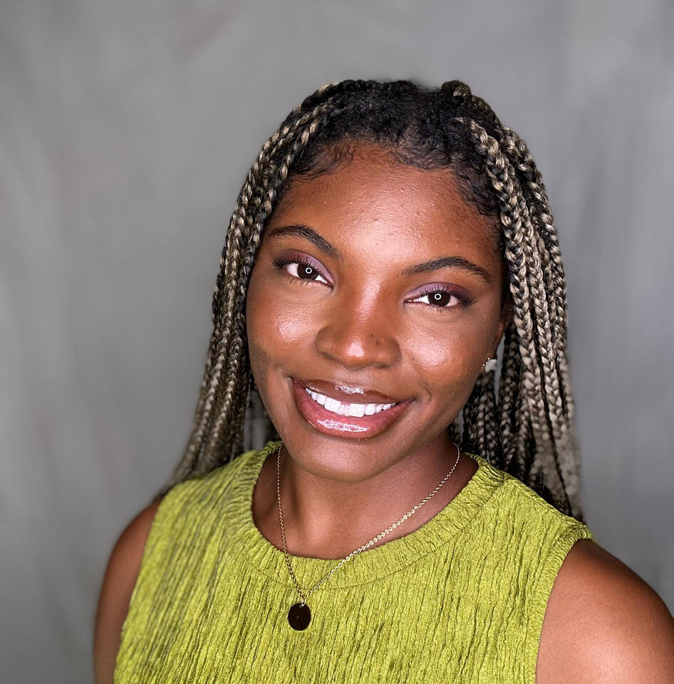
👋 I'm Jada Rabe, a UI/UX Designer based in Omaha, Nebraska. I'm a designer who designs for the ultimate experience.
Jada Rabe
Contact Me
jadalawson38@gmail.com

Jada Rabe
Nice to meet you ☺️
I’m a UI/UX designer from Jackson, Mississippi, with a childhood shaped by living all over the U.S., from big cities to small towns. Growing up this way taught me to see things from different perspectives and stay open to new ideas.I’ve always been drawn to art and fascinated by how people think and interact with the world. Over time, I discovered my passion for technology, and UI/UX design became the perfect way to bring all these interests together. I love creating designs that not only look great but also solve real problems and make life easier for people.My goal is to create thoughtful, impactful experiences that leave a positive impression.
I love...
spending time with family 👨👩👦
anything outdoors ☀️
movies! 🎥🍿

Jada Rabe
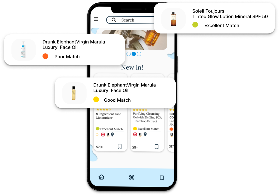
Elevia is a skincare app that personalizes recommendations and shopping. I built Elevia's brand and user experience.
| Timeline | Platform | My Role |
|---|---|---|
| Aug - Oct 2022 | Mobile application | UX researcher, prototyping, UI design, wireframing. Branding, and design system building |
Background
Most people are wrong about their skin type, which will lead to the purchase of the wrong products.
The skincare industry is plagued by consumer confusion and product choice overload. Elevia aims to address these issues by offering a solution that reduces the uncertainty surrounding skincare product selection.
Problem
Elevia’s app provides personalized skincare recommendations by analyzing your skin. It's top priority is focused on one use case – uncertainty in users' skincare purchases.
Elevia has trouble making its app easy to use and exciting, even though it suggests skincare products tailored to each user. In order to address this, the issues below need to be executed. Conquering the use case will lead to the goal of improving the app's design for better usability, engagement, satisfaction, and to keep users coming back and loyal to the brand.
Finding products that works for your skin was too complicated
Gathering the data for skin analysis had low engagement
The app has difficulty in retaining its users
Research
After surveying and interviewing, I gained insights on skincare user behaviors. I learned what they were after and how I could attain it on the app.
I surveyed 5 people based on why they use skin care products and how they do so. I did this to get a basis on how frequently they would use the app which led to interviews to find out how their experience was while shopping for skincare products. I found these insights
Save Time: Design the app to be efficient, helping busy users save time.
Engage Users: Create an appealing design that encourages users to explore more.
Support Skincare Goals: Offer easy access to info and personalized tips for users looking to improve their skin.
Show Value: Highlight how the app’s recommendations save money and provide effective solutions.
Those findings led me to explore more on what users think, say, and do.
My findings reveal that users invest significant effort in researching skincare products and seek clarity through questioning. However, they express frustration over the load of misleading information they get. Additionally, there's dissatisfaction from the lack of upfront pricing visibility. Still, they remain motivated towards simplifying the shopping experience.

Early Ideation
With the empath's map help, I set off to create sketches. These sketches led the way towards finding out what the users actually needed.
Before my sketches were alternated, this was the beginning. I found that the users wanted to see less on the screen, simpler navigation, and a different action buttons design. So I got to work.
Focusing on navigation and clutter, I cleared the illustrative elements and revamped the navigation with simpler routes and wording. This influenced me to test the changes with site maps.


By creating the sitemaps it proved that the navigation was still too complicated and needed more revision. In addition, I was able to reevaluate the sitemap and interviews to craft a user flow that made a great transition into the final product.

Learning from user feedback, I improved navigation by simplifying the user flow, redesigning pages, and updating wording.
After testing the wireframes, I realized the navigation was a maze that left users puzzled and frustrated. Not the outcome I hoped for, but invaluable feedback. I revamped the user flow, simplified pages, and updated wording. Now, users are navigating with ease and satisfaction.
With the changes in mind I created a user flow that led the way for the first prototype. The pathways were clearer and made the routes much easier to understand.

Prototype to Assess User Experience on Item Location and Communication
Here’s the outcome after several iterations, however this is not the final design. This prototype will help me understand how users feel about locating items, communication, etc in the user testing phase.

User Testing
Work In Progress
Streamify
Fun Entertainment For Everyone
Hey there 👋
I’m Jada, a UI/UX designer passionate about creating experiences that connect with people.In late 2023, I worked on Streamify, a mobile streaming app struggling to convert free users into paying subscribers. With so many platforms competing for attention, users felt overwhelmed and, honestly, a little frustrated.My mission?
Make Streamify feel more personal, engaging, and worth the upgrade.
🎯 The Problem
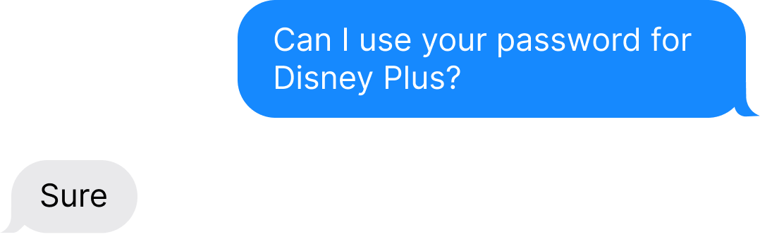
Streaming services today are... well, kind of a mess.Users want variety, but content is scattered across different platforms. And let’s be real—no one wants to juggle multiple subscriptions (or sneakily share passwords with friends 👀).
What I Set Out to Do
Help users see the value in upgrading
Create a smoother, more personalized experience
Keep it fun, not sales-y
✨ The Approach
I started by talking to real people.I surveyed and interviewed young, tech-savvy users who love content but hate paying for it. Here’s what stood out:


Data was sampled from 12 people
What I Learned
| User Insight | My Design Solution |
|---|---|
| People want variety but hate switching apps | Add big categories + rental options |
| Users will upgrade... if it feels worth it | Clear pricing & feature breakdown |
| Pop-ups are annoying 🙄 | Subtle, in-app nudges work better |
🛠️ The Design Process
I focused on making Streamify feel simple, familiar, and fun—like your go-to entertainment hub.
Key Screens
1️⃣ Onboarding that actually makes sense
2️⃣ Flexible plan options
3️⃣ Smart content recommendations
4️⃣ Easy profile management
🔍 Testing, Testing...
I ran usability tests with 8 users, asking them to:
✅ Find a movie they couldn't get on other apps
✅ Decide if upgrading was worth it
✅ Explore without feeling pressured
🎉 The Results
✅ Higher engagement with premium features
✅ More users upgrading after the free trial
✅ Less frustration, more fun
What’s Next 🚀
I’m excited about adding:
AI-powered recommendations
Interactive live content & events
Social features to connect with other fans
So, why did this work?
Because I stopped trying to “sell” a subscription and instead focused on what makes streaming fun for real people.
COMING SOON
A full case study is underway, details will be provided in the near future
COMING SOON
A full case study is underway, details will be provided in the near future